The refurbishment of the complex at Via Canonica 79 in Milan: a careful renovation while re-elaborating tradition
The residential building, in the heart of the Borgo degli Ortolani in Milan, was recently renovated by the Milan-based firm De Amicis Architetti. Located near Via Sarpi, the heart of Chinatown, and a stone’s throw from Corso Sempione and the picturesque frame of the Arch of Peace, the complex at Via Canonica 79 was the object of a meticulous and detailed refurbishment, reintroducing itself to the city of Milan with a more eye-catching and contemporary look, the result of a careful reflection on preexisting elements and the juxtaposition of materials.
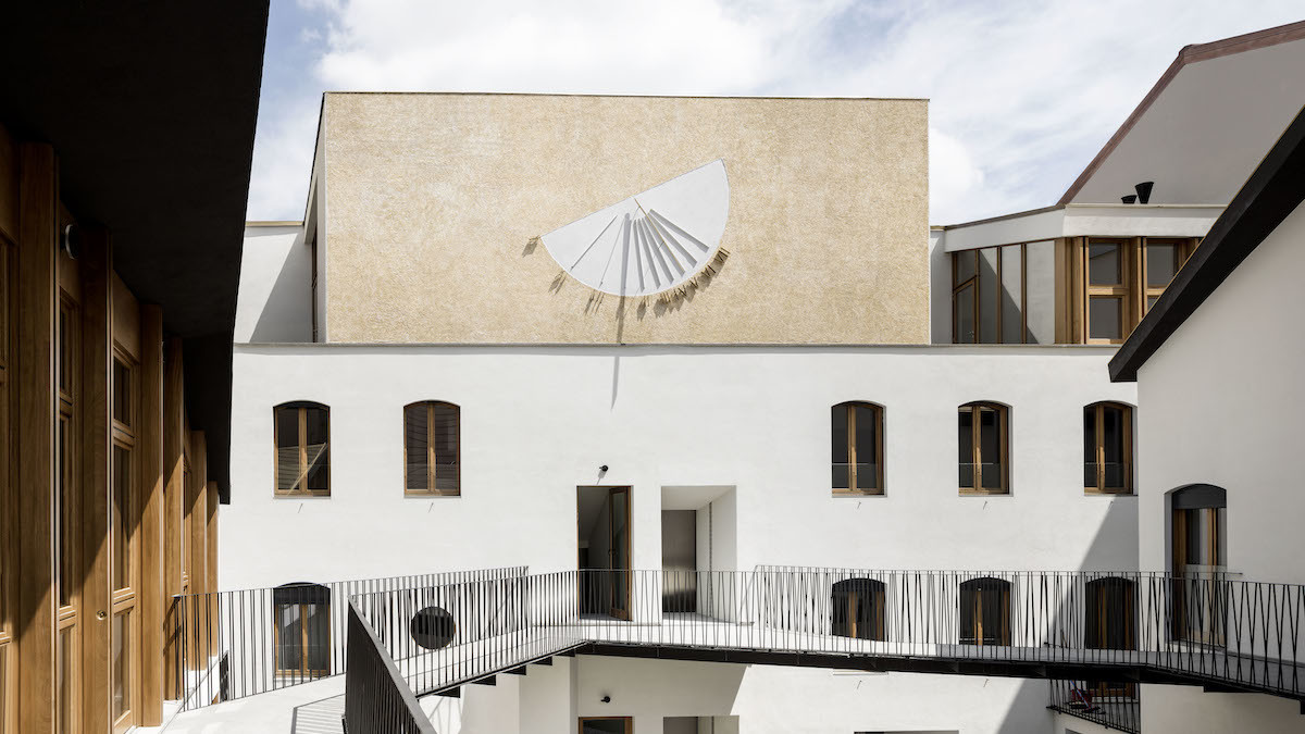
At the core of the intervention is the dialog with what the designers call the “sense of time”, time marked by the shadow of the large sundial in the inner courtyard, by means of a re-elaboration of models and languages belonging to tradition. An effort in terms of design which is the fruit of the virtuous interpretation of what exists, in the attempt to create a “new”, dynamic building, in step with the times.
The sense of time and the building
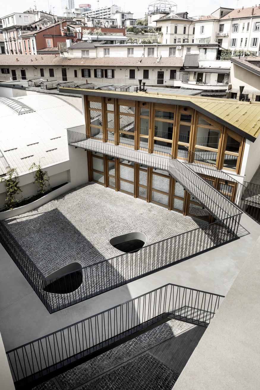
Structured around an inner courtyard, typical of Milanese social housing, the original complex was made of three separate buildings. Two of these, organized following an L-shaped structure, were connected by means of a gallery system, while the third, lower one was used as workshop.
The character of the new intervention conceived by De Amici Architetti can be easily read on the facade on the street. While, in fact, the first and second floor preserve their original features, the commercial ground floor and the additional top floor provide new rhythm to the facade.
A crucial role is played, in the new configuration as well, by the inner courtyard, the beating heart of the building, which gains a new look and structure. The flooring of the new courtyard, made of split rizzata (rizzada in the Lombard dialect), recalls with its pebbles the typical pavings of squares and ancient Milanese streets.
On the one hand the designers state that the expedient of raising the level of the courtyard allowed them to maintain a balance between full and empty spaces without altering the proportion of the interior space. On the other hand, this design choice allowed them to obtain an underground level for the garages – without needing to excavate further below the level of the foundations – parking spaces that are lighted naturally thanks to two light wells dug into the new “mezzanine” level of the inner courtyard.
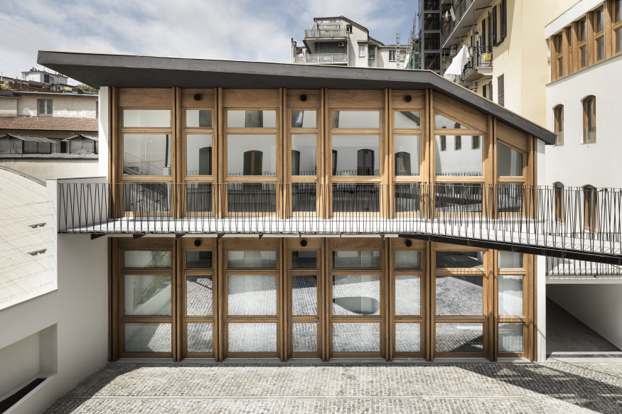
The distribution system of the building is also rethought and reduced, In fact, a single staircase and a single elevator constitute the vertical distribution of the three blocks, which are then connected by a gallery on the first floor. The 16 apartments are different in terms of typology and dimensions: simplex, duplex and loft.
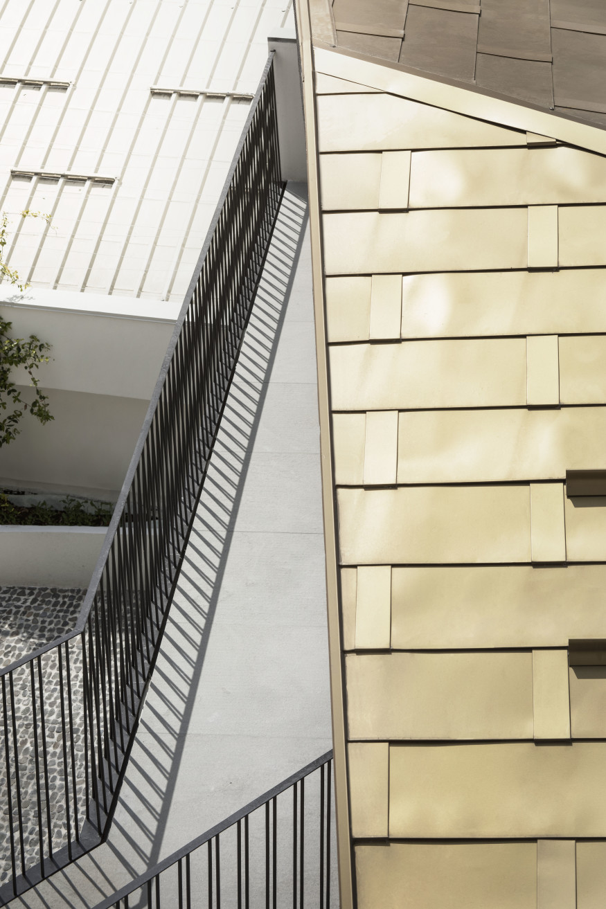
Another element in the composition of the complex in Via Canonica is represented by the light wrought iron railings. Railings that are marked by the thin lines of the handrails, alternating with the slightly divergent ones of the columns, which contribute in creating a play of clear, distinct geometric light and shadow – never invasive – on the neutral color of the inner facade.
This way the gallery system, typical of Milanese tradition, is redesigned in an evocative way, without becoming the preponderant element on the inner front and leaving space to the large sundial. The sundial is on the south front, dominating the inner courtyard on a wall fully covered in yellow glass grit.
The Materials of Via Canonica 79
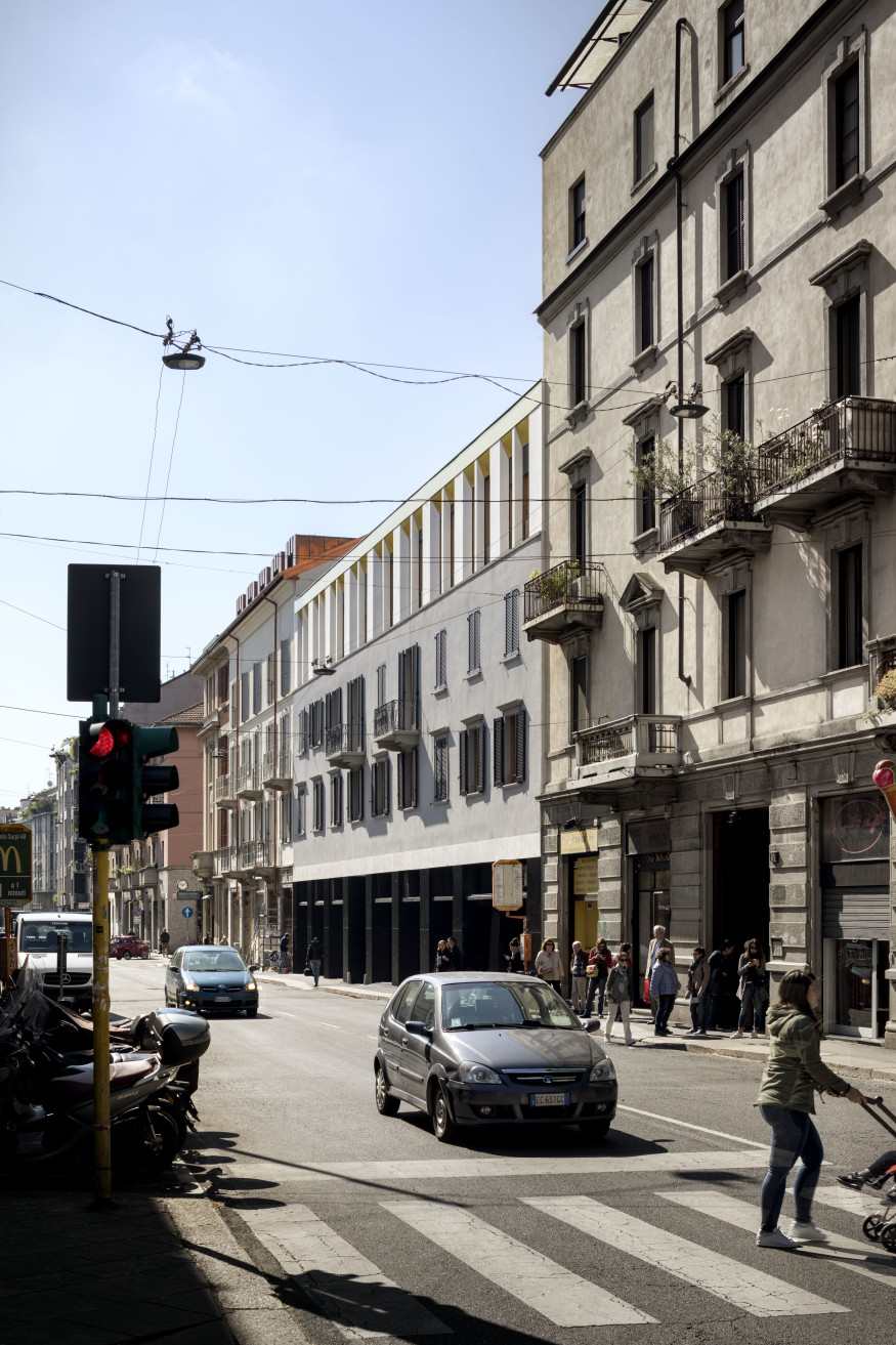
The choice of the materials was studied carefully: totally different elements, apparently irreconcilable, are wisely juxtaposed in a compositional exercise with an extremely intriguing result, where different textures and finishes create reflections and shades that animate the project. Neutral colors in fact are next to the wood of the window frames and the darker shades of dove gray and black on the inner and external front, with highlights given by the use of brass or yellow glass grit.
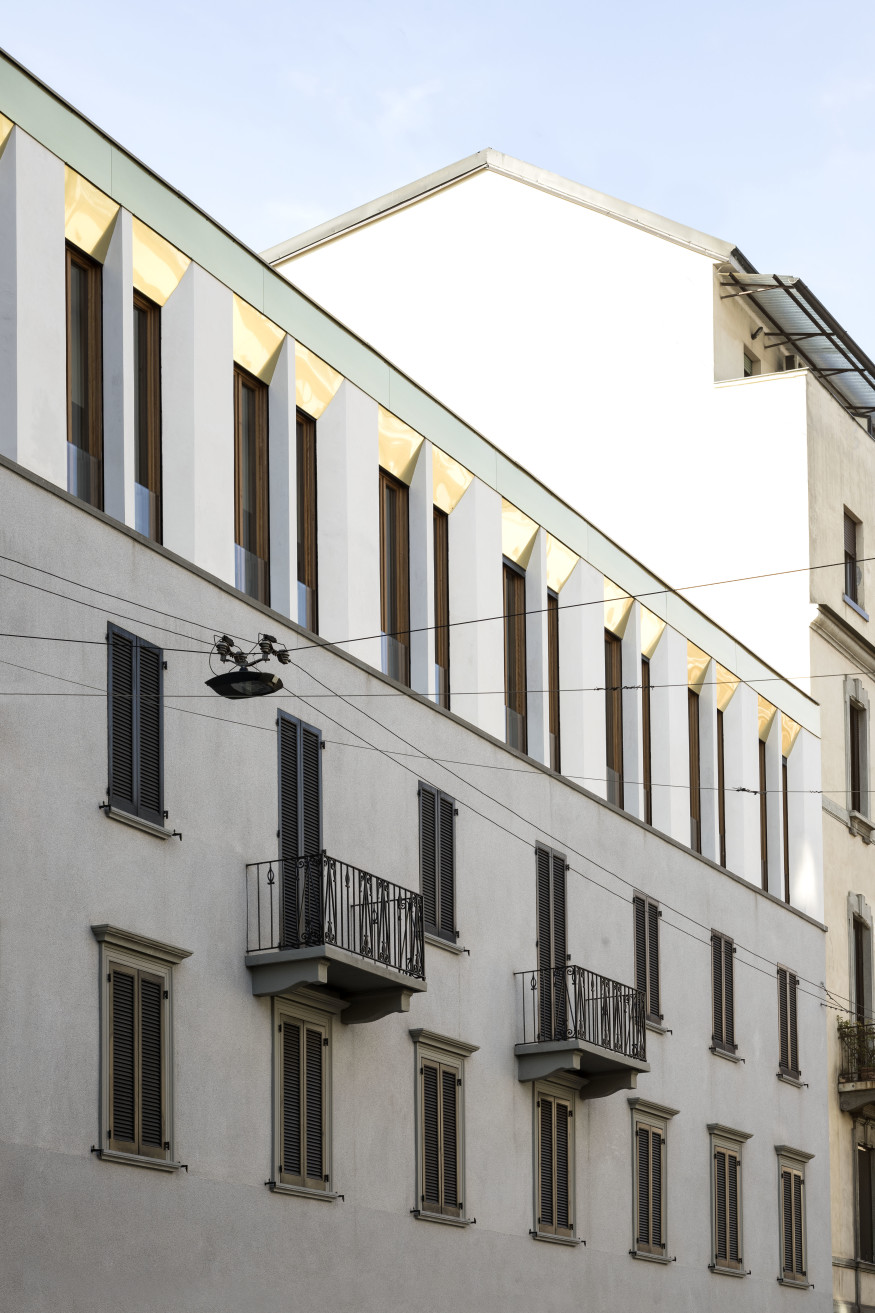
This original feature finds its expressive clarity on the external front, thanks to the use of very different finishes, which however, working in concert, show an overall coherence in their precision. The commercial ground floor has black marble finishes, while the top floor recalls – in white - the rhythmical sequence of the ground floor, where brass splays highlight the architraves of the openings, connecting the third level with a mint green band that runs along the entire front.
The language used along the inner facades, instead, differentiates the building once used as a workshop, which today is lower, from the other two. On the inner front, the total absence of full walls leaves room to a nearly total visual permeability, where glass surfaces alternate only with the wooden uprights.
A refurbishment project, not only of a building but of an urban and “construction” memory, through small compositional steps, in its wise use of materials and the redefinition of spaces in a contemporary perspective.
Project Data:
- Design Team: De Amicis Architetti
- Contractor: Bailo Srl
- Consultants: SPS Srl (structures)
- Systems: Studio Giarba
- Iron works: Pietro Landi Snc
- Marbles: Bailo Marmi
Photo by Alberto Strada - courtesy of De Amicis Architetti


