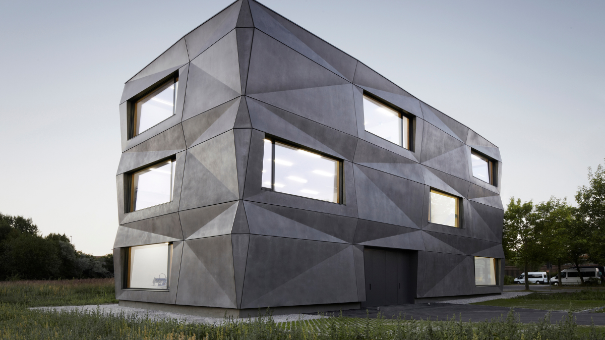
Situated in an industrial zone on Munich’s north side, the building hosts production and office spaces for the “Textilmacher”, a company which specialises in printed fabrics and embroidery.
Its iconic feature is the geometrically folded facade, which deforms the simple rectangular cubature by an animated play of light and shadow.
The matt bright surface of the anthracite pigmented concrete responds to its environment. Depending on the season, time of day, weather, and light incidence, the facade continuously changes its appearance and character.
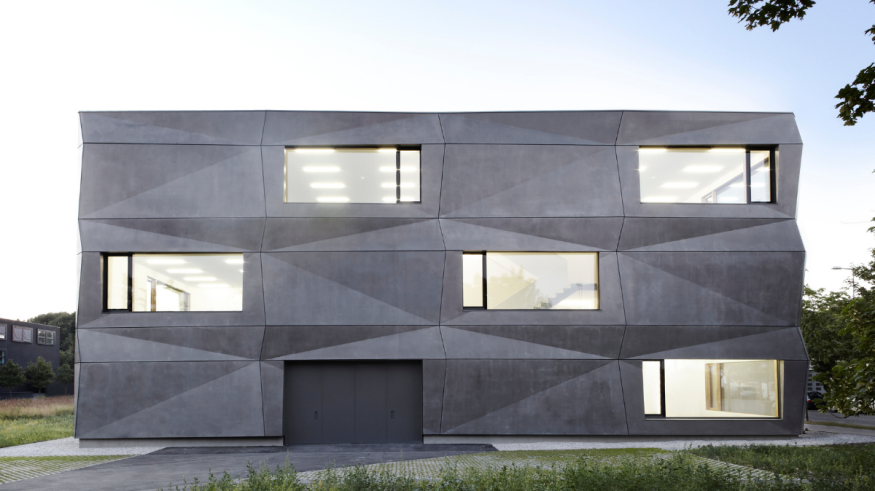
Modularity, a short construction period, and financial benefits led to the selection of a pre-cast concrete facade with core insulation. All together only four different formworks were built for all panels, two for the long side and two for the short side. Designed on the computer, they were executed with craftsmanship. The challenges in producing the panels were the seamless, sharp-edged concrete envelope and the free of pores surface. Measuring up to 6.6 x 3.9 m, the modules, with outer shell, insulation, and structure shell, were built in the factory and delivered one by one to the construction site. The dark and satiny look arises from iron oxide pigments in the outer shell and a hydrophobic treatment. The patterned surface is based on a variation of 16cm in thickness as well as in length. By moving back and forth the dark joints between the panels intensify the deformation.
The mounting sequences were carefully planned, allowing the elements to be fitted one in another like a puzzle.
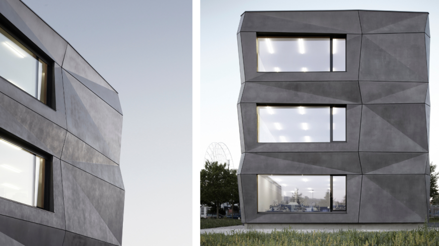
Dark grey doors complement the pigmented concrete, and windows with fixed glazing and casement are slightly recessed so that their frames are barely visible from outside. Due to the concealed post-and-rail construction and vertical joints with step glass they apear like nothing more than a pane of glass. The sunscreens with 5.2 x 2.1m are made with a seamless textile fabric and routed in a zip system. The dark colour allows a good perspective from the interior while it is non-transparent from the outside.
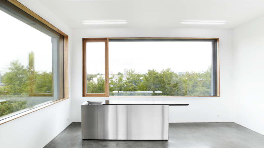
In contrast to the expressive facade, the interior design leaves more space for the production process and the products in the showroom.
The limitation on few, but high-class materials, is the main concept in the interior.
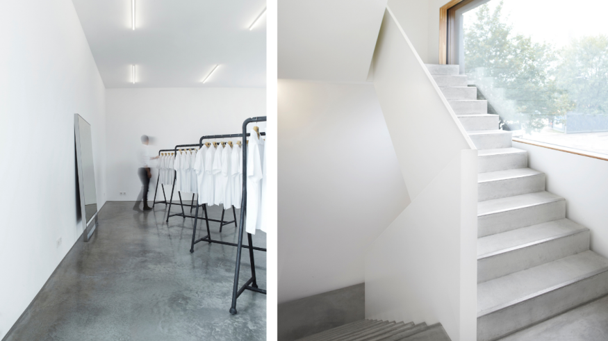
Polished concrete flooring, window profiles in larch wood, white walls and white-coated steel are the dominating materials. Column-free spaces and similar floor plans in all levels provide a high grade of flexibility and a constant adaption to changing processes in work.
The production is located on the ground and first floor, while the offices and the showroom occupy the second level. Storage and plant rooms are found in the basement.
To leave as little carbon footprint as possible, the waste heat of the production units is being reclaimed by heat exchangers and reused in the building by the screed heating. Finally the green roof and the voluminous concrete façade act as temperature memory reducing the need to intervene technically.
Credits:
- Source: Mediakit of Tillicharchitektur
- Photographer: Michael Compensis


