GEZA’s enlargement of the Pratic headquarters, between continuity and contrasts.
The firm GEZA, Gri e Zucchi Architetti Associati has recently completed the enlargement of the headquarters of Pratic F.lli Orioli spa, working on a building it had inaugurated 7 years earlier, presenting a follow-through, a second season. Pratic 2.0 is the evolution of the business based in Fagnana, in the province of Udine, as well as the continuation of an architecture project and idea.
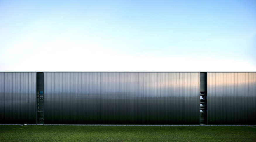
In fact, just a few years after its inauguration, the world-leading company specialized in the design and manufacture of awnings and pergolas “doubles”, focusing on two themes: simplicity and efficiency. The expansion included an increase in the spaces dedicated to production and research, but also new offices, a showroom and wellness areas, with a simple and direct intervention, which plays with continuity and contrasts mainly by means of a careful and elaborate material effect of its facades.
An apparent simplicity
According to Bruno Munari, simplifying things was the most difficult part of the creative process, much more than complicating them: to remove and reduce one needs to be aware of the sense of the final result, that is one must know what to remove. Similarly, clarity and simplicity in a building are neither banal nor obvious: a closer and more careful look reveals an elaborate complexity, inevitably multiplying the levels of interpretation.
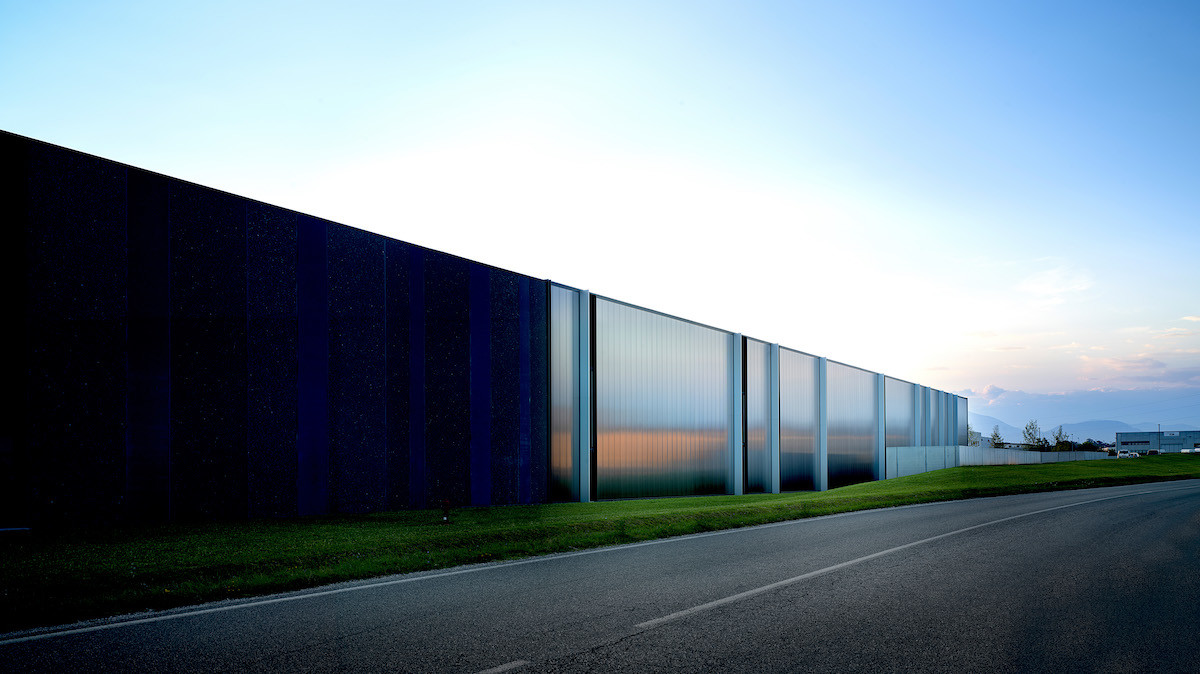
Pratic, a pioneer company in the production of sun awnings, is located in the industrial area of Fagnana, in a territory characterized by agricultural production. The intervention to expand the company headquarters aims at conversing with this landscape – especially when seen from afar – restoring the strong horizontality of the context. If observed closely, this horizontal development is generated by combining elements whose main feature is, instead, verticality. They are 10m full-height panels that mark the striated facades and enclose a productive space of about 9,000 sqm - now doubled.
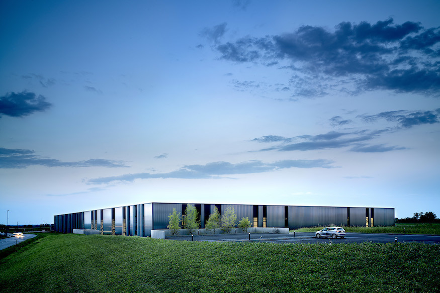
The reference to the geometry of the surrounding cultivated fields is clear especially when seen from the sky: the plots of land, the many divisions of the agricultural parceling, are characterized, like the building, by stretched and regular shapes. The development of the building adopting a rectangular layout is emphasized and further marked by the structure of the covering, made of prefabricated concrete beams alternating with curved infill elements with sandwich panels.
The expansion, carried out in a way that is coherent with the first building, uniformly multiplies its program: there are offices, a showroom, research and innovation laboratories, spaces for production, painting and warehouses, and a wellness area for employees – the only part of the building that is on two levels and includes the canteen, services, a gym, the wellness area and locker rooms. The intervention on the landscape observes continuity with the previous one through “embankments” that integrate changes in the gradient and different levels of the terrain, just like the signs already present in the morphology of the surrounding landscape.
This way, redesigning the greenery, which includes parking spaces, pedestrian paths and areas for relaxation, preserves continuity with the context without losing its functionality.
The cladding of the facades, between rhythm and materials
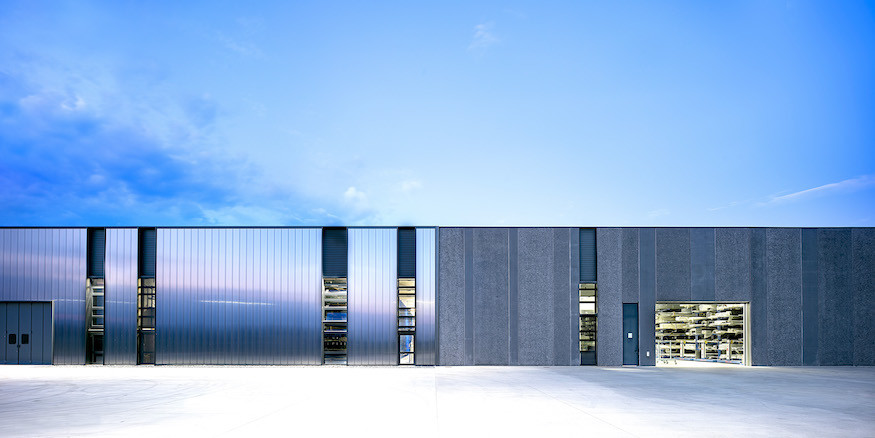
The facades of the expansion contrast with the ones of the existing building: the latter, material, is clearly separate from the former, reflecting and iridescent. The Pratic 1 building is in fact characterized by three different treatments as to the panels on its facades, corresponding to three different dimensions: aside from the glazed windows, there are two types of full-height prefabricated panels, treated on the surface with black marble grit or using black concrete.
The Pratic 2 expansion, instead, has two different solutions on its facades: ventilated facades in two-colored polycarbonate alternating with ribbon windows with aluminum profiles, with concealed vent and motorized transom opening.
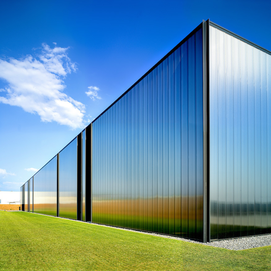
These panels, 10m high and 4 cm thick, have a dense vertical texture to hide the load-bearing structure. The final effect, nearly iridescent, is obtained by overlapping two different types of polycarbonate: while the lower, opaque layer filters the light, a “frozen” finish with a small percentage of black gives the envelope continuous color variations. The external luminous intensity, in fact, determines its appearance and color, while the distance of the observer also affects the perception of the new volume of the Pratic headquarters.
You can thus say that half of the building is characterized by a persistent, heavy and permanent presence, while the other one is more volatile, ever-changing and light.
GEZA’s intervention is not only aimed at giving shape to a new landmark through the Pratic building, but it also wants to prove how an industrial construction can guarantee high levels of functionality thanks to its careful and precise design, which synthesizes the complexity in a “direct” artifact, with no mimicry, an added value for the landscape it is set in and the company it represents.
Adding new value to the landscape and workspace, reestablishing a relationship between architecture and nature, a relationship where man is at the center.
Project Data
PRATIC 2
- Window frames and facades: Pavarin F.lli Snc
- Prefabricated structures: Pre-Systems Spa
- Carpentry works: Iron+ Srl
- Structural design: Nuttassociati
- Plant engineering: E4F Srl
- Mechanical systems: Vaportermica Commerciale Srl
- Electrical systems: Impresa Tonon Spa
- Landscape and building works: Slurry Italia Srl
- Interior finishes and furniture: Multitema Srl
- System walls: Adotta Italia Srl
PRATIC 1
- Prefabricated structures: Spav Prefabbricati Spa
- Structural design: Nuttassociati
- Mechanical systems design: Studio Bulfon Associati
- Electrical systems design: Studio Battista
- Mechanical systems: Vaportermica Commerciale Srl
- Electrical systems: Elettrica Ducale Snc
- Building company: Edildri Costruzioni Srl
- Landscape: Slurry Italia Srl
- Office and custom-made furniture: Multitema Srl; Moroso Spa
- Photovoltaic system: Sataenergy Spa
Photos by Javier Callejas


