Fluid spaces and contrasting materials for an apartment in Madrid
The transformation of this house, which occupies a thirteen-story tower in a residential neighbourhood of Madrid, represented a fundamental challenge: making the original space, which was split into different areas and not very flexible, become fluid and open by integrating the numerous pipes and vertical structures typical of such a building into the project, without losing the height of the ceilings and enhancing the generous natural lighting of its perimeter.
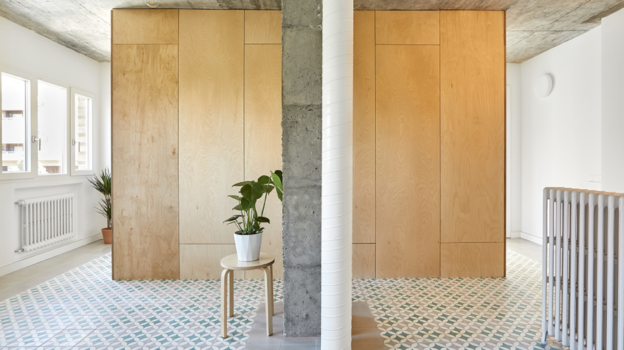
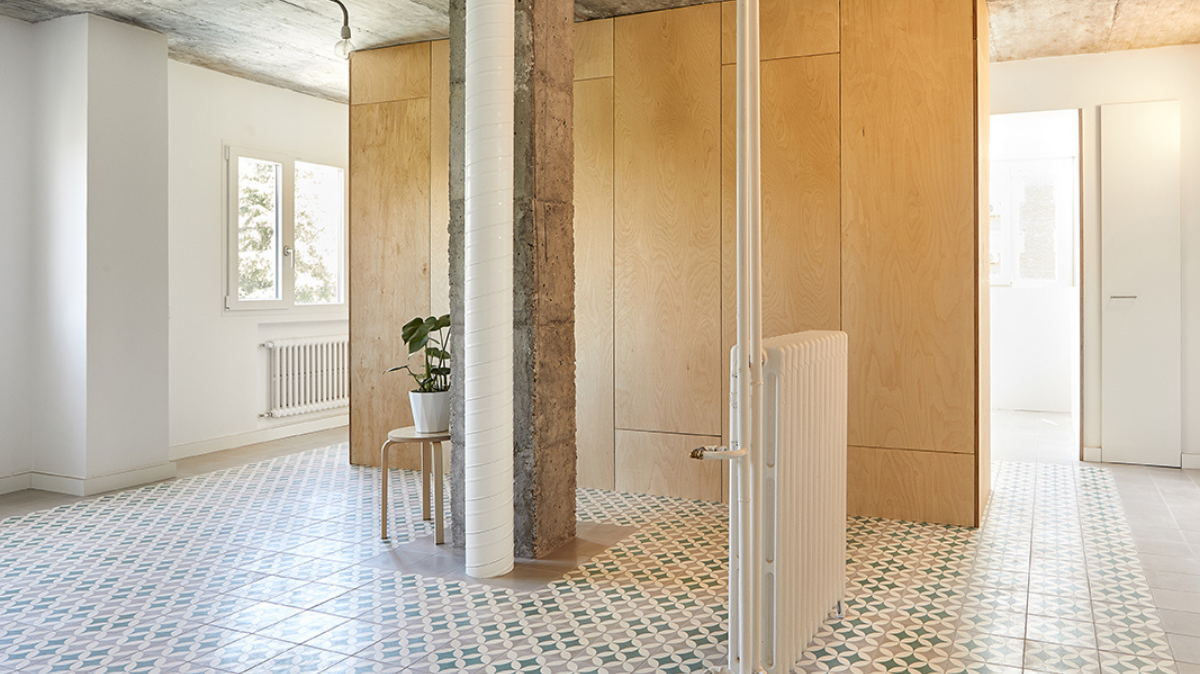
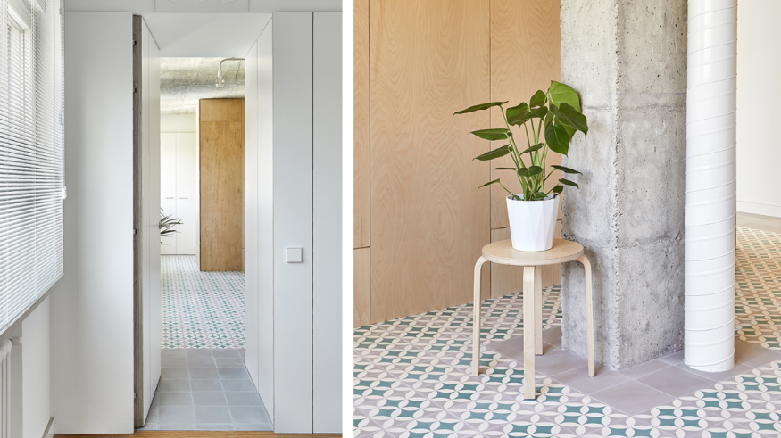
Once the original partition walls of the house were removed and the initial structure restored, the project developed around simple actions. The focus was to unify the main areas of the house through a hydraulic mosaic floor. Together with the original reinforced concrete slab, this element creates a continuous space articulated through the only piece that interrupts the horizontal vision of this area: the birchwood kitchen cabinet. The house is a floor, a roof, and a piece of furniture.
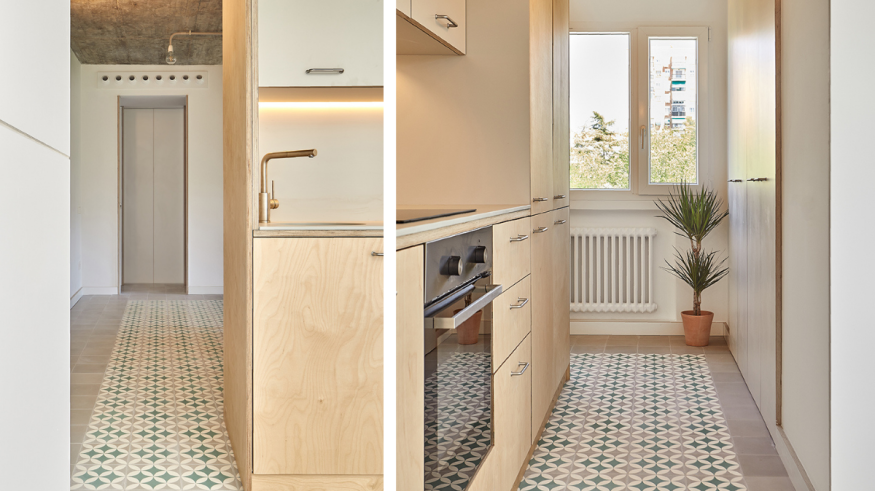
The house is a floor, The living room, kitchen, and dining room unify and become the central space of the house. A hydraulic mosaic floor was used to enhance its continuity; it combines smooth pieces (on the edges) and geometric ones (in the central space). With its geometric ornament, the hydraulic mosaic was traditionally used to delimit and rearrange very compartmentalised spaces and to give them the regularity that their perimeter did not allow. With direct references to Paulist and Mediterranean architecture, the fluid space of the house is thus contained and arranged at the center thanks to colour and geometry.
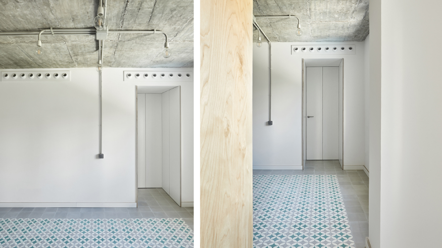
The house is a roof
The second element that reinforces the fluidity of the house is the ceiling. The original concrete slab is restored to exposed concrete, creating a continuous level of materiality and height throughout the house's main space. The ceiling loses its continuity only to define and differentiate the living area from the sleeping area, providing it with the privacy it requires. To do this, the bedrooms and bathrooms are accessed through two deep entrances where the roof reduces its maximum height to 2.20m, thus emphasising the passage from one area to the other. This second part of the house, more private, is organised in a simple way. The bedrooms are isolated from the external activity through a "strip" where the entrances and a storage area are located. The bathrooms are created in adjacent spaces, adapting to the position of the original fixtures and thus reducing the pipes.
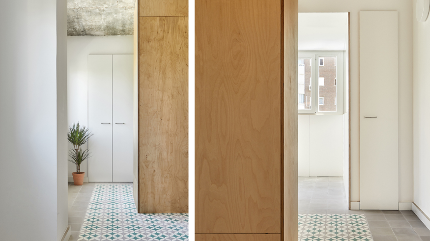
The house is a piece of forniture
The only element that interrupts the horizontal vision between the two parallel levels (the geometric one of the floor and the "bare" ceiling) is a birchwood cabinet containing the kitchen. This way, the continuous space of the house articulates through a single piece that becomes the protagonist of the project. The piece of furniture finalises the configuration of the fluid space, connecting and defining the accesses to the kitchen and laundry area. Vertical pipes, radiators and uprights that interrupt the horizontal view are treated with simplicity and functionality. Both the materials and the fixtures are used in their raw state, showing their unevenness.
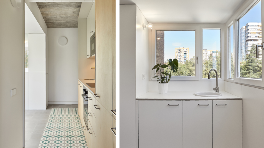
We thus obtain a fluid space that is articulated and ordered at its center thanks to geometry and colour.
Credits
- Press Kit: minimo pro
- Photography: Davit Ruiz


