Architectural studio Bureau de Change has unveiled a new pavilion extension to a Victorian terrace house in Stoke Newington, north London.
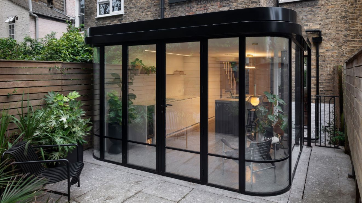
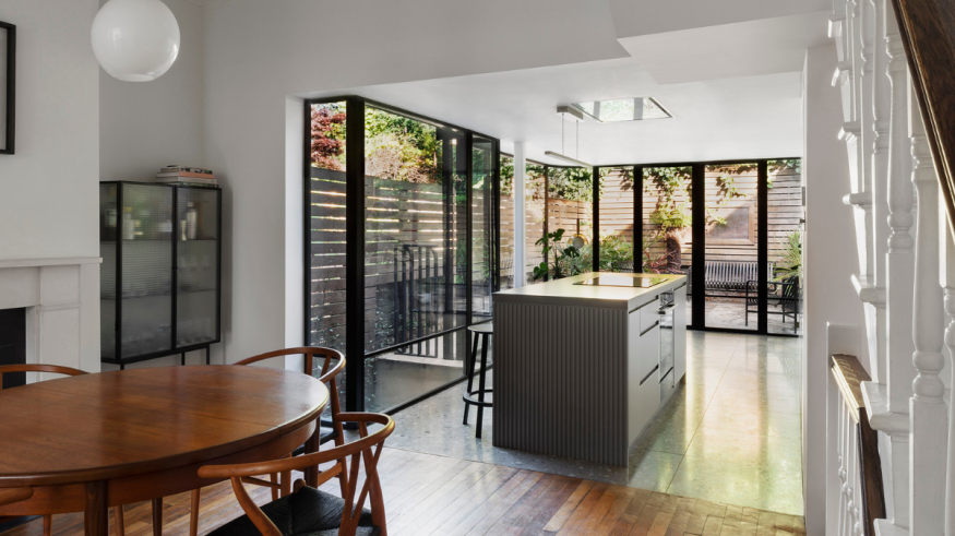
The new 112sqm north-facing glazed pavilion creates a seamless transition from refurbished kitchen to re-landscaped garden. The pavilion’s elegant form with narrow mullions is inspired by the curved shopfront windows of the Victorian era. The simplicity of the form belies a complex structural solution which creates the sense of a floating roof, allowing focus to remain on the glazing and views out to the garden. A monochrome interior palette, together with the dark frames of the glazing, creates a neutral backdrop for the owners’ furniture and homewares.
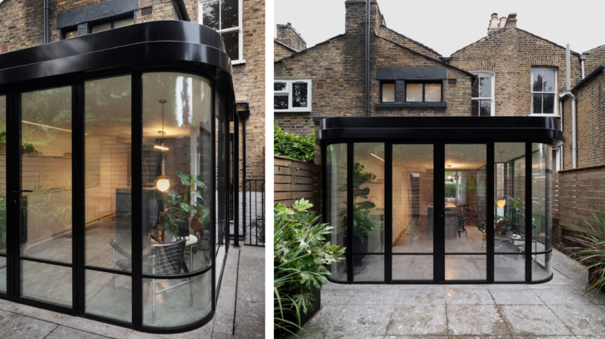
The single-storey pavilion is sandwiched between a basement level and first floor bathroom; the design had to respond to existing levels and ceiling heights and nestle carefully within. To open up the space laterally, the pavilion roof is designed as a cantilever, with a single narrow column providing structural support. The complex structural balancing act is concealed in the roof soffit, which appears to float with ease above the pavilion’s glazed walls. The resulting structure is as lean as possible, celebrating the geometry of the curved glazing.
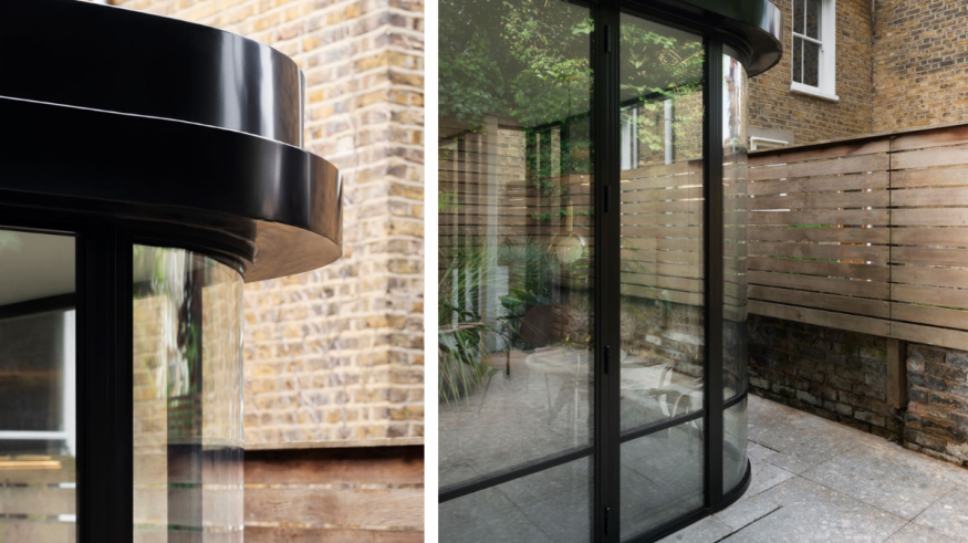
The architects’ design process began with research of the area, including the exploration of historical catalogues used to build Victorian shopfronts. A key characteristic of this period is filleted glass corners used to frame entrances and form bay windows, along with features like ornamental cornices and decorative window bars; these elements inspired the design.
All the design moves have a practical purpose: the filleted glass softens the massing of the extension, and the cornice has a practical purpose in concealing the drainage. Horizontal glazing bars add a sense of grounding and scale. Pavilion House is part of a well-preserved terrace where the homes include habitable basements. The new extension has been designed with a unique kinked footprint to ensure that daylight passes through the rear basement lightwell to reach the guest suite at basement level. It pulls away from the side of the house and is kinked inward just enough to maintain the basement’s light. The push and pull of the glazed façade creates special geometric moments, as well as preserving a narrow side garden between the kitchen and the party wall fence, which when fully planted will create a sense of being enveloped by the lush garden.
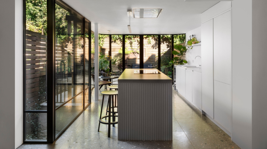
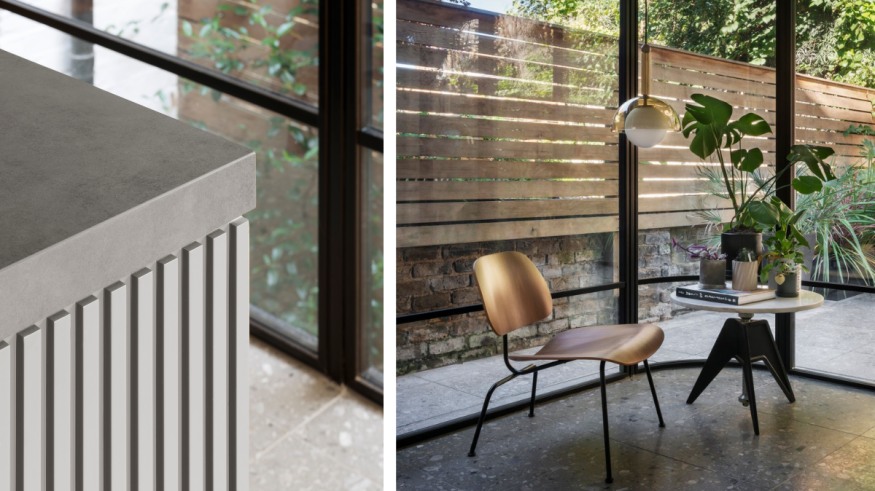
For the interiors, the architects chose a soft gradient from white to grey, creating a neutral backdrop to delineate the black frames of the pavilion. The kitchen’s wall units, sink and tap are all white, to blend into the background. A dark work island acts as the focal point of the space; its countertop is clad in stone, and bespoke routed timber panels cap either side. A terrazzo floor runs from the extension to the garden, with a subtle change in texture to allow for outdoor slip resistance. This unifies the two areas, connecting house and garden.
Credits
- Press Kit: Bureau de Change
- Photography: Gilbert McCarragher


