“Everything was designed with the intention of disappearing, since space is the real protagonist and welcomes within it the sweetness of the Montefeltro hills.”
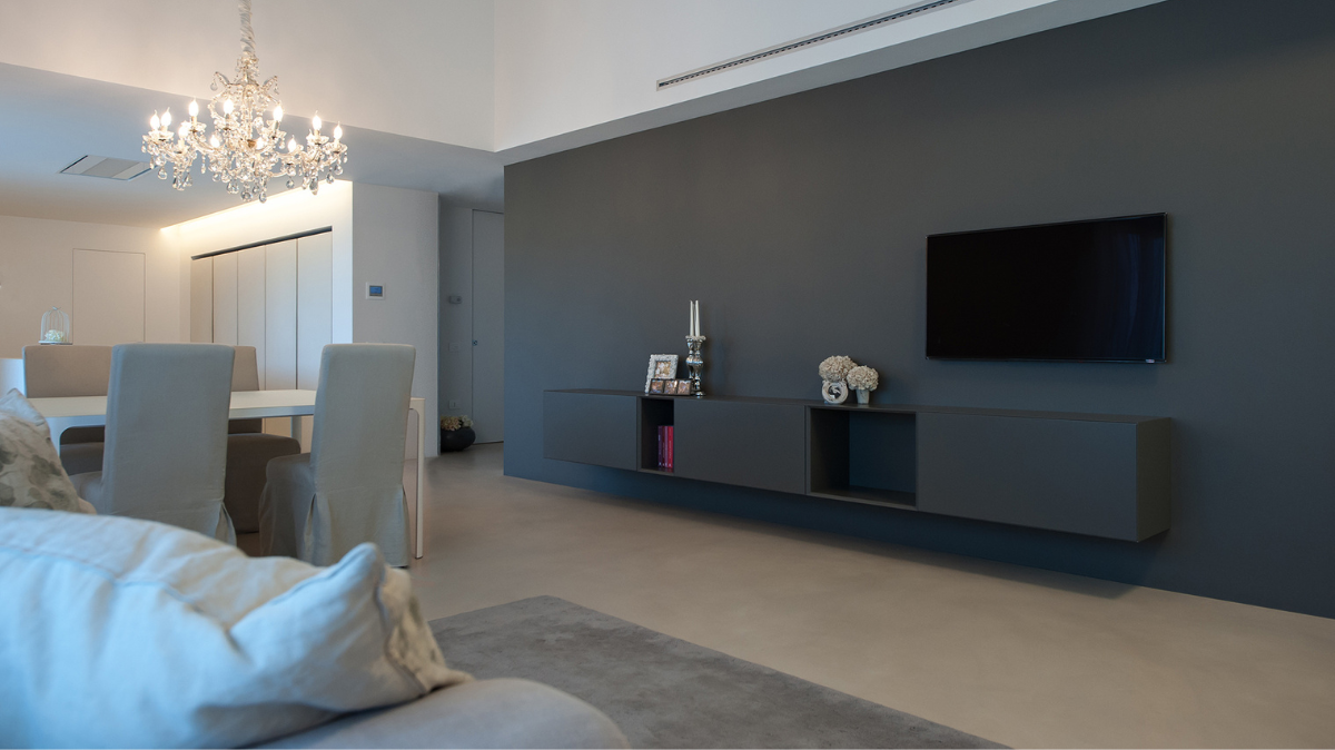
The 150-square meter penthouse is the achievement of a multi-level tailored renovation. The client’s desire to have a fluid and continuous space characterized by diverse materials has led to the selection of special finishes and furnishings. The attic floor deletion, which previously divided the top floor from the attic, also highlighted by the strong chromatic choices that define the two levels, has almost doubled the volume in the house’s living area, making it airy and elegant. A balcony that runs along the entire west wing connects the two living areas (the living room and the dining room), creating a continuum between exterior and interior and amplifying the large open space.
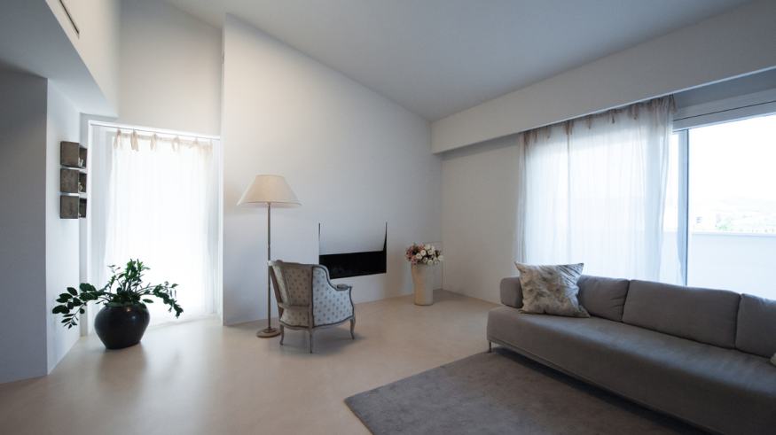
This continuity is also emphasized by the cement mortar floor which extends over the entire walkable surface as a single slab, continuing outdoors where it becomes drainage and is distinguished by a larger diameter grain size.
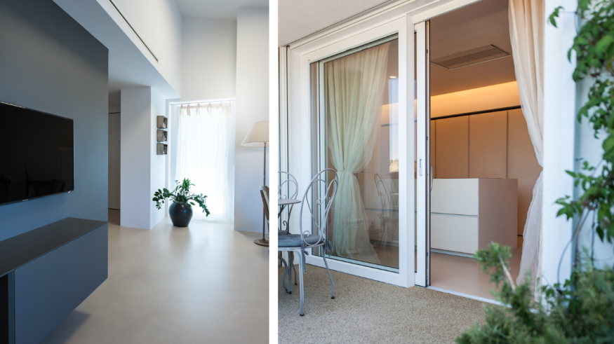
The minimalism created by the floor can also be found in the kitchen and in the choice of its finishes. Within the kitchen only the cuts of the vertical cabinets and the grooves of the drawers of the central island, which stands out in the middle of the room like a monolith, are evident
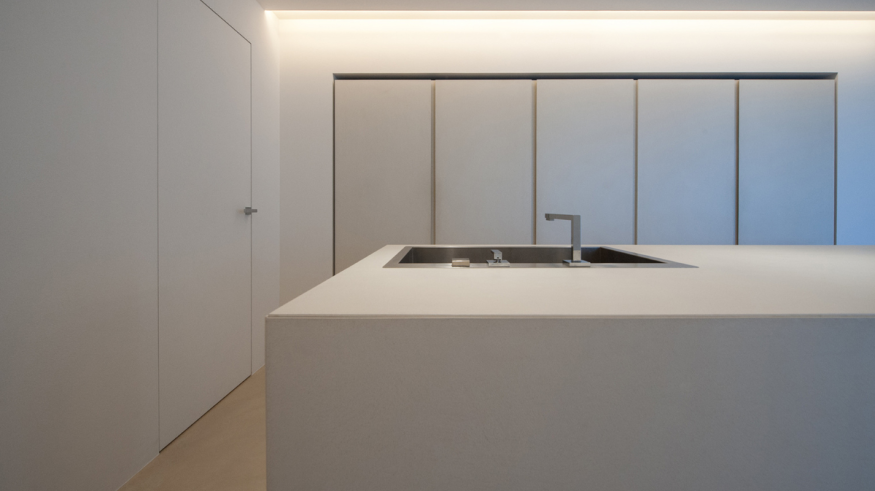
The flush-to-wall doors, with the absence of trim, follow the same minimalist concept and make the space even more fluid. This feature is also emphasized by the use of a floor heating and cooling system powered by a photovoltaic system, which does not include any type of wall module.
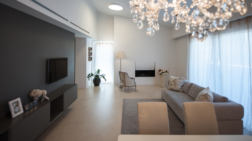
Within the design, the choice of the chromatic scale enhances the sense of openness and continuity of the spaces. Working with grey scale material has allowed us to avoid strong broken effects; the same fireplace is so integrated into the wall that it is in perfect symbiosis with it. The third dimension is perceived only by the presence of a sharp and precise cut that gives dynamism to the entire composition.
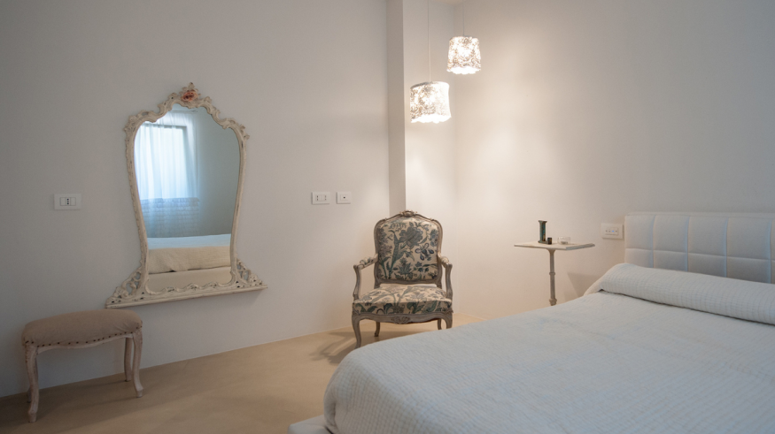
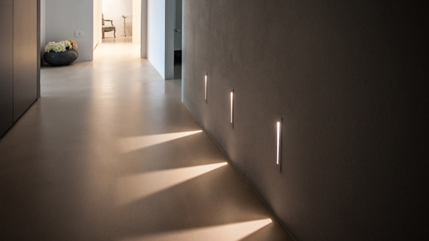
The choice of lighting helps to enhance the color contrasts as in the corridor where a play of light and shadows marks the path, drawing signs that are completely similar to slits on the walls. The only element that goes beyond the refined minimalism is the large chandelier in the living area, as if to indicate that the center of the house is located there.
Credits
- Press Kit: L2
- Photography: Simone Tommasini


