House Z22 and Warehouse F88, a renovation project where the architecture firm Gus Wüstemann Architects AG prefers the use of natural finishes, bringing out the raw, rough effect of stone to create warm environments with material quality.
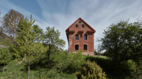
Subject to the new regulations on the conservation of buildings of historical importance in Zurich, the large pre-existing residential complex is 170 years old. The project, aimed at respecting the past, is structured following regulatory principles and taking advantage of them for a design that is out of the ordinary.
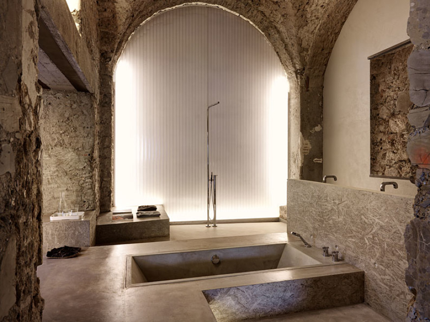
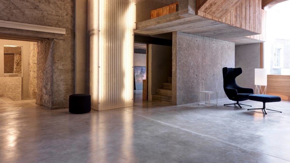
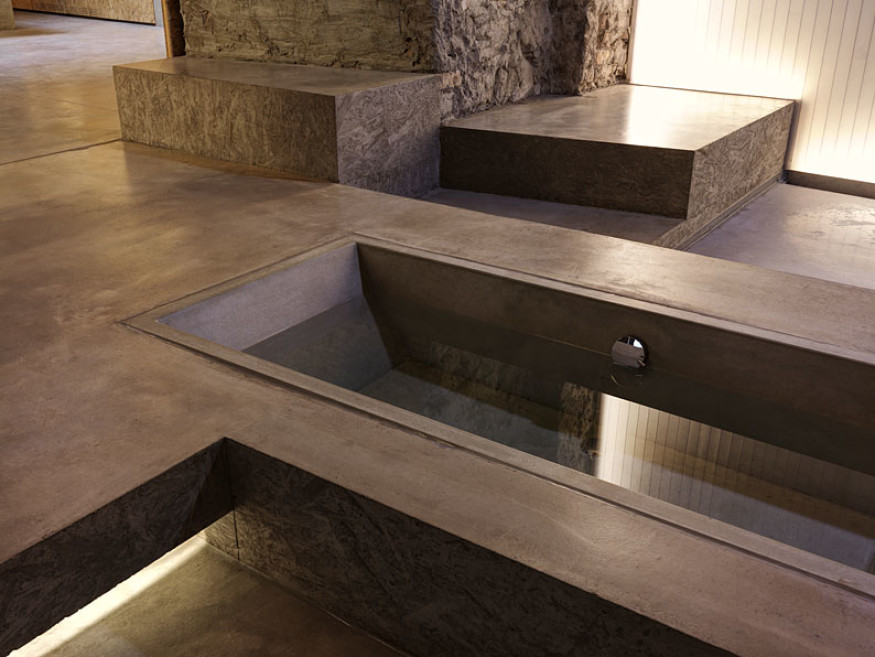
Spaces and thresholds are obtained from the section project, creating small and large internal differences in height, raising the floor to form the block of the kitchen or sinks, then lowering it to define the shower tray and finally creating a tub; a double height on the hall, an open study as a suspended path. Unconventional open spaces, with flexible functions, where living intertwines its dimensions in a free, authentic way, between imposing and massive stone walls.
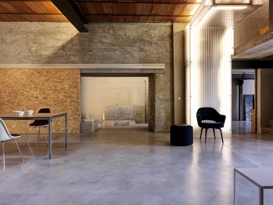
Today exposed, these stone walls represent the solidity of the building over time. A solidity that the architecture firm Gus Wüstemann Architects AG, based in Zurich and Barcelona, wanted to immediately impress through the treatment of the materials used for the renovation.
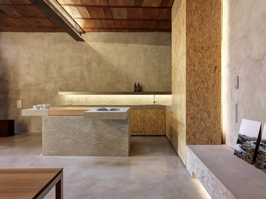
Materials left in a raw, almost primitive state, resulting from a study of cohesion and dialogue between the existing volume and the new intervention. A natural and ancient stone, found in the construction site by removing the layers of time, the layers of plaster, to bring it to new life. Then, raw concrete, raw wood, raw plaster.
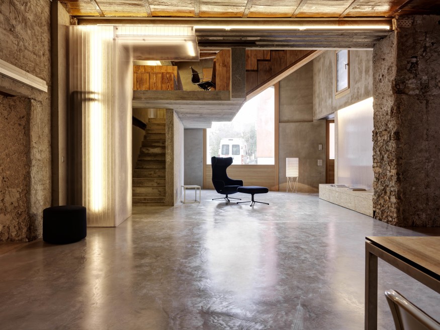
Next to it, translucent and backlit walls that provide diffused light: ex-novo finishes that leave room for interpretation, consequences of a way of designing that sees in the material all its potential to characterize space. A tribute to matter, with no hierarchies, in the space of a new "promenade architecturale" divided between rooms with small dimensions.
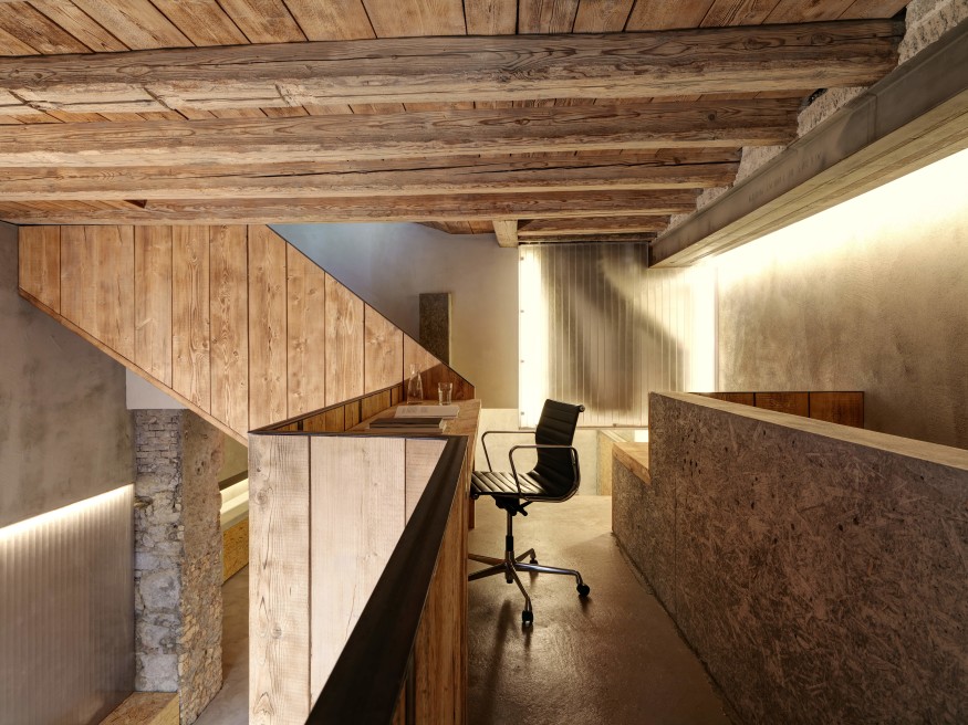
A simple volume, treated with complexity in its material resolution. A promenade in a confined space, where the perception of the atmosphere and the wise use of materials contribute to widening perspectives, creating welcoming and warm environments. Next to the roughness and irregularities of stone, the furniture is designed with square shapes.
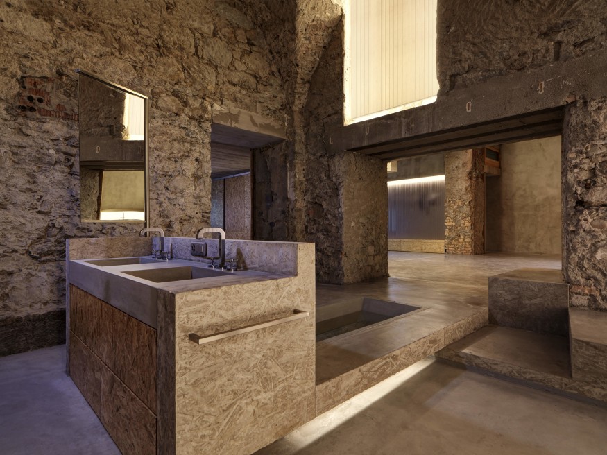
Between poetry and matter, a renovation takes shape. The shape of a residential complex. Five small apartments and four ateliers. The shape of the delicate relationship between what exists and what is new, between yesterday and today.
CREDITS
Architecture:
- gus wüstemann architects, www.guswustemann.com
Team:
- Manuel Greter
- Bianca Kilian
- Valentin Kokudev
- Daniel Pelach
- Panagiota Sarantinoudi
- Gus Wüstemann
Photographer:
- Bruno Helbling, www.helblingfotografie.ch
Ingenieur:
- Born Partner AG, www.bornpsrtner.ch
HLSK Planer:
- Frei + Partner, www.frei-partner-ht.ch
Contractors:
- Builder: Corti AG, www.cortibau.ch
- Concrete Furniture: Dade Design, www.dade-design.com
- Carpenter (Flats): Ernst Wieland AG, www.wieland-ag.ch
- Carpenter (Ateliers): Gebert Möbelgestaltung, www.gebert-online.de
- Windows (wood): Huber Fenster, www.huberfenster.ch
- Frameless Sliding doors: Skyframe, www.sky-frame.com
- Spengler: MARTI Komfortlüftung & Bauspenglerei AG, www.marti-kls.ch
- Skylights: Cupolux AG, www.cupolux.ch
- Heating : Kurtisi, www.kurtisi-ag.ch
- Sanitary: Heierli Partner Haustechnik AG, www.heierlipartner.ch
- Plasterer: Agosti AG, www.agosti.ch
- Metal + Sky Frame: R+R Metallbau AG, www.rrmetallbau.ch
- Floors: Fiechter + Fuchs AG, www.fiechterfuchs.ch
- Carpenter: Cremer Bruhin AG, www.cremerbruhin.ch


