The American Institute of Architects has named nine winners of its 2019 award for interiors
The American Institute of Architects (AIA) has recently announced the winners of the Interior Award 2019, a program whose goal is to celebrate the most innovative and spectacular interior spaces. In particular, the award aims – as stated by the American institute itself – at selecting “impactful building interiors which make their mark on the cities, places, and spaces where we live and work”.
The winners of 2019 are nine projects, based in the USA and other regions in the world, which include a variety of spaces and different programs: retail spaces and corporate spaces, a place of worship and a courthouse, a rehabilitation center, a restaurant and an event center. The projects selected by AIA’s five-person jury, “must demonstrate design achievement, including a sense of place and purpose, of ecology and environmental sustainability, and of history”.
The winners on the list are more or less known to the general public, large engineering and architecture companies – such as Gensler and SOM (Skidmore, Owings & Merrill) both awarded twice – along with world-renowned architecture firms (BIG-Bjarke Ingels Group) and American firms with strong roots in the territory:
Apple Store, New York, NY, Bohlin Cywinski Jackson;
Design Office, Austin, Texas, Alterstudio Architecture;
Hyundai Capital Convention Hall, Seoul, South Korea, Gensler;
New United States Courthouse, Los Angeles, LA, Skidmore, Owings & Merrill LLP;
Noma, Copenhagen, Denmark, BIG-Bjarke Ingels Group;
Optimo, Chicago, IL, Skidmore, Owings & Merrill LLP;
Shirley Ryan AbilityLab, Chicago, IL, HDR + Gensler + Clive Wilkinson Architects;
St. Pius Adoration Chapel and Prayer Garden, New Orleans, LA, Eskew+Dumez+Ripple;
Studio Dental II, San Francisco, CA, Montalba Architects.
The interior spaces which emerge from this selection interact with history and the built heritage, as in the case of the Apple Store, where reuse takes place through the renovation of a Beaux Arts building, or in that of Optimo, where the Owings & Merrill firm restored a decommissioned firehouse turning it into a space for the production and sale of luxury hats. Other ideas are for flexible offices, those by Montalba Architects and Alterstudio, where modern aesthetics takes shape in the renovation of historical buildings, projects which are counterbalanced by the interiors which focus on the “public” character of the buildings housing them, as in the case of SOM.
At the extremes of this range, which includes renovation and new public spaces, we find the “biological” project by BIG and the “technological” one by Gensler
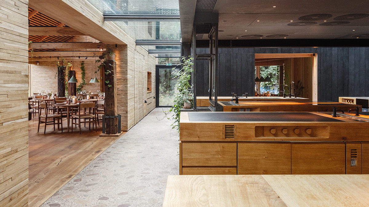
In Noma we find the warmth of wood and brick, whereas in the Hyundai Capital Convention Hall one gets lost in the infinite white of its technological materials and walls.
The project signed by Bjarke Ingels Group for the new Michelin-starred restaurant Noma in Copenhagen, built on the site of a former military warehouse, is imagined as an “intimate culinary garden village”. The main concept of the project is to dissolve the restaurant’s individual functions while organizing them in a collection of separate but connected buildings, grouped around the heart of the restaurant: the kitchen. From this central position one enjoys a view of the entire restaurant, allowing all guests to see and follow what generally takes place behind the scenes. The dining rooms are wooden volumes with light flooding in through the side and the skylight on the ceiling, where convivial warmth takes shape also thanks to the walls made of stacked timber planks. The large windows reveal a new relationship with nature, with its seasons, clarifying the restaurant’s gastronomic choices. Outside in fact are three greenhouses used as a garden, a test kitchen and a bakery. The different buildings are linked by glass walkways which connect cozy spaces and different building techniques – as well as materials – which are typically Nordic. It is no coincidence, since Noma actually is a syllabic abbreviation of two Danish words: "nordisk" and "mad", that is “Nordic” and “food”.
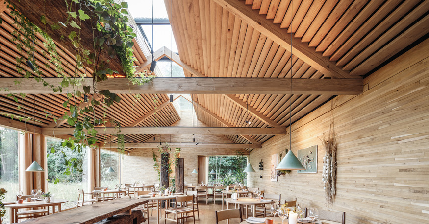 Noma - Photo by gentle courtesy of Bjarke Ingels Group
In the case of the Hyundai Capital headquarters, designed by Gensler in Seoul, the key word is flexibility. In fact, the space inside the Convention Hall changes depending on the needs: training sessions and company meetings, as well as conferences and events. Different functions, for different kinds of audience, which led the Gensler firm to opt for a minimalist visual experience and a technological approach, both in terms of acoustics and lighting.
In the Hyundai Capital Convention Hall there are many references to the corporate logo, the stylized “H”, and the cyclorama walls of photography studios. In this case the enveloping environment is created by a completely white experience, emphasized by the reflective resin floor and the white walls and ceiling cut only by strips of light. What changes is the perception, which dissolves into a unique example of light and space, giving the observer a feeling which fades into something between art and architecture.


