Wood and gold in a 60’s revival
The open, seemingly never-ending space required a “graphic” design that would highlight various areas of the multi-brand store. The somewhat “classic” training of the young designer, which derives from his birthplace, San Giuseppe Vesuviano, a small town on the slopes of Vesuvius and close to Pompeii, is evident in his contrasting but always controlled chromatic pursuit, as in the Pompeian frescoes of the Roman era.
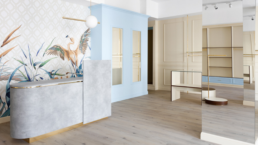
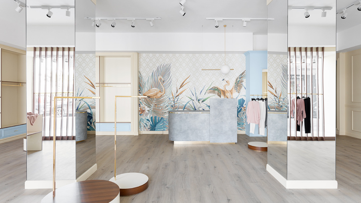
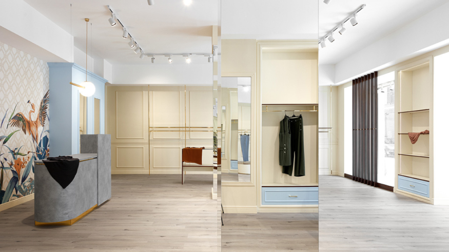
This study of color, born from the desire to create order in open space, is also a reinterpretation of 60’s design in a modern key, highlighted by the chrome-plated gold hangers and the moldings on the walls. To this, another contrasting graphic interplay is added, defined by the horizontal and vertical shelves in warm colors, edged in walnut essence that give the right compositional rigor to the environment.
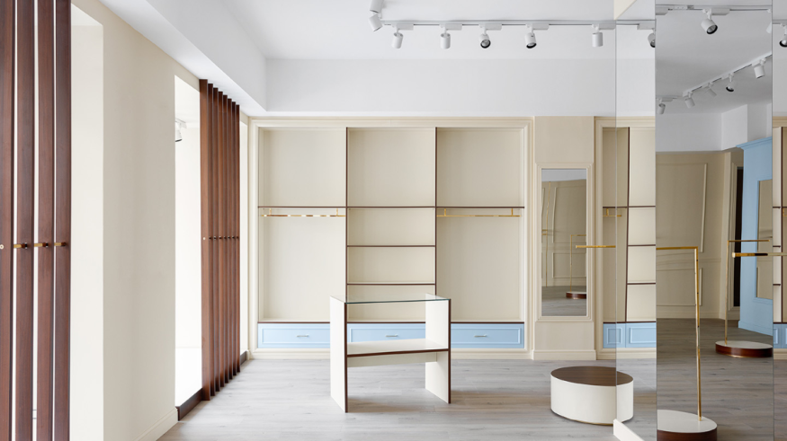
The space was designed to have maximum flexibility, in fact all the horizontal shelves can be moved at will and change the display of the garments. Four cylindrical corners and three display tables move freely in the space to disrupt the continuous color scheme of the wooden floor. The only elements that disrupt the general view are two pillars, but their total mirror coating doubles the space creating an optical illusion of continuity, making this interruption almost imperceptible.
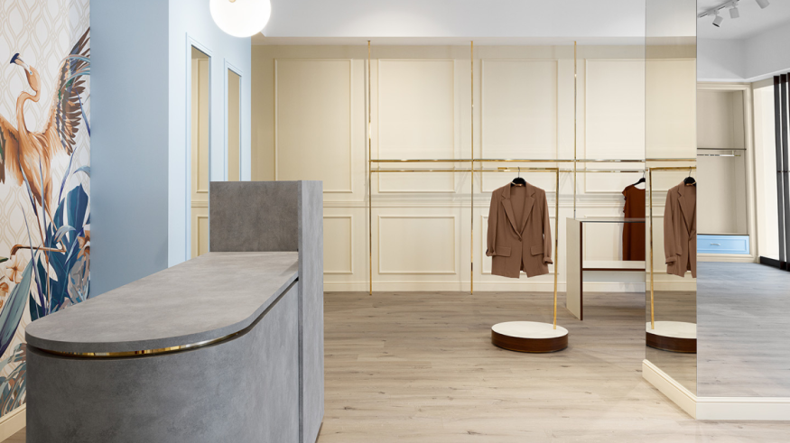
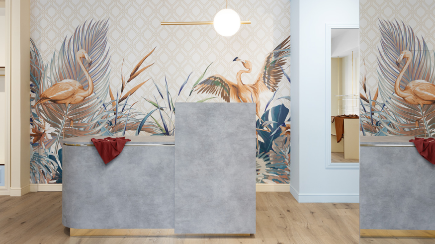
Inside the Store, an exclusive space has been created for designer haute couture garments that stands out from the other exhibition areas with a full-wall paneling defined by a gold chromed structure that gives brightness and embellishes the whole environment. This creates a very minimal silhouette inspired by the lightness of flamingo’s limbs that the wallpaper in the cash register area features. This last area is identified by a monolith with gray tones and marked in gold that contrasts the wall with wallpaper in various shades, giving this specific area a very powerful overtone that attracts the visitor.
In the shop windows the graphic interplay is totally vertical made of walnut strips with a gold chromed bar interposed, this design interplay allows it to perform a triple function, that of a partition between inside and outside, of hangers to accompany the exhibition, and that of display for preparation of the shop window.
Credits
- Press Kit: Dudesign
- Photography: Carlo Oriente


